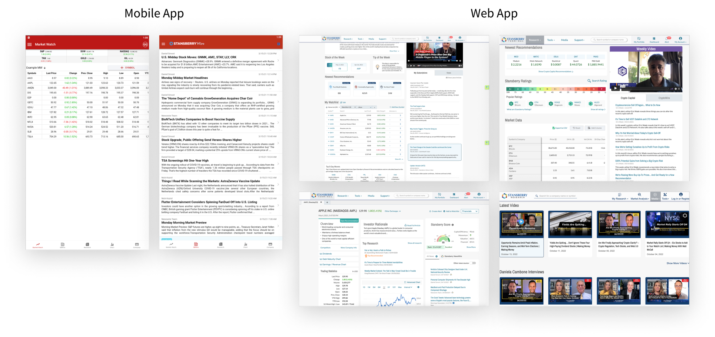
Stansberry Investor App Redesign – Redesigned the mobile app to deliver a seamless experience across platforms
In Q3 2020 - Q1 2021, I was the main designer, leading the project from ideation to execution. Throughout the project, I worked closely with cross-functional teams, including a digital product manager, engineers, editors, and Marketing.
Project Summary
Stansberry Research offers digital products with investment research and advanced analytical tools for investors. However, the old Stansberry Investor mobile app was missing core features and lacked consistent branding with the web app. After conducting user interviews, it became clear that most users wanted a new mobile experience that provides a seamless transition between web and mobile on the go.
User Goal
Easily access the core features such as market news and stock watchlists on their phone while commuting or traveling.
Business Goal
Ensure a seamless transition between web and mobile apps to reduce any friction. The main KPIs to define success will be retention rate, churn rate, and the number of active users.
The Problems
Inefficiently Structured Features
While Stansberry Newswire and Research are the most used editorial content, they are spread out in two separate tabs, which forces users to switch between tabs to access editorial content.
Feature Discrepancies
We should provide a unified and high-quality product experience across all platforms. However, the old mobile app only provides a limited number of features, and some core features are missing. Through user interviews, we discovered that their frustration mainly came from the disparities in features across platforms.
Inconsistent Branding and Experience
The old mobile app was developed without a design system in place which caused gaps between mobile and web apps in visuals and functionality.
The Solutions
Streamlined Features for Efficiency
All the editorial content is grouped under the Research tab, making it easy for users to filter articles by type. With the new experience, users can filter articles without switching between tabs and easily access exclusive content from their subscribed editors. This page enables users to explore a variety of editorial content while conveniently checking stock prices of their interest at the top of the page.
No more gaps, Just More Customization
We integrated all the core features into the mobile app, enabling users to have a seamless transition between web and mobile apps. To cater to users with different needs, we added a dynamic bottom navigation bar that allows users to reorder items and access features based on their preferences and needs.
Cohesive Experience through Design System
To deliver a visually and functionally cohesive experience across platforms, I collaborated with cross-functional teams to develop a mobile app toolkit that aligns with company branding and the existing design system.
Final Screens ⬇
Impact
We conducted user testing with 8 participants using the final design, and 87% of them successfully completed the given tasks and expressed satisfaction with the new app experience.
Overall, users were satisfied as they were able to easily access all the core features and make investment decisions without facing any physical and technical limitations.
We successfully launched the new Stansberry Investor app on both Google PlayStore and the App Store in March 2021. During the first month of only internal promotion, we saw a significant number of downloads and received positive feedback. Our App was also featured on the AppAdvice.
Next Steps
Work with the Marketing team to come up with strategies for app promotion and user education for a smooth transition from the old app to the new one.
Monitor the KPIs (retention rate, churn rate, and number of active users) and continuously enhance the product based on user feedback.


